Craftsman Home Color Palettes: Choosing Body, Trim, and Accent Colors That Work
Home / Blog
Craftsman Home Color Palettes: Choosing Body, Trim, and Accent Colors That Work
The Craftsman style is one of the most rewarding architectural traditions to paint. Its exposed wood brackets, wide overhanging eaves, board and batten siding, and layered decorative details create natural opportunities to use color in a way that highlights craftsmanship rather than concealing it.
In Ventura, CA, Craftsman bungalows and ranch-style homes with Craftsman influences are a common sight, and getting the color palette right means understanding both the historic roots of the style and how those palettes hold up in coastal California’s particular light and climate.
Why Color Matters More on a Craftsman
Unlike modern stucco homes where a single body color dominates and trim is minimal, a Craftsman has multiple distinct architectural elements that each need their own color consideration. Brackets, columns, window surrounds, porch railings, and decorative gable details all read as separate surfaces — and how they’re colored in relation to each other determines whether the home looks intentional and cohesive or busy and unplanned.
A well-chosen Craftsman palette does two things: it honors the natural, earth-connected aesthetic of the style, and it uses color contrast strategically to highlight the architectural details that make the home distinctive.
The Three-Color Framework: Body, Trim, and Accent
Every Craftsman exterior is built on three layers working together.
Body Color
The body is the dominant surface — siding, board and batten, or wood cladding — and sets the overall tone of the home. Craftsman homes historically draw from nature, which is why warm browns, deep greens, olive tones, slate blues, and warm grays have always anchored the style’s palette.
Body color principles for Craftsman homes:
- Choose a color with depth and warmth rather than a flat or cool neutral
- Avoid colors that read as too bright or contemporary — Craftsman palettes feel muted and organic
- Dark body colors (deep brown, charcoal, forest green) are period-appropriate and increasingly popular in coastal California
- The body color should feel like it belongs in the landscape, not in contrast to it
Trim Color
Trim on a Craftsman includes fascia boards, window surrounds, corner boards, and porch columns. It defines the edges and structure of the home and typically provides the strongest visual contrast in the palette.
Trim color principles for Craftsman homes:
- Crisp white and warm cream contrast cleanly against deep body colors
- For a more period-accurate look, warm off-whites and ivory work better than stark modern white
- Decorative brackets and corbels are typically painted the same as trim or in the accent color, depending on how much emphasis you want to place on them
Accent Color
The accent is where a Craftsman palette comes to life. Used on the front door, shutters, decorative brackets, or gable details, it adds personality and visual punctuation without overwhelming the overall scheme.
Accent color principles for Craftsman homes:
- Deep, saturated tones work best — forest green, burgundy, navy, terracotta, mustard, or matte black
- The accent should complement the body color, not compete with it
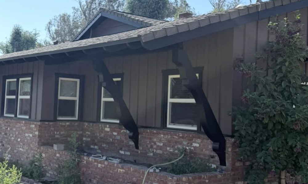
- Matte black has become a particularly popular choice for Craftsman brackets and structural details
- Keep it disciplined — one or two accented elements per facade is enough
Five Palette Directions That Work in Ventura’s Climate
- Deep Brown Body / Black Brackets / White Trim
A rich, warm brown body pairs naturally with matte black on exposed brackets and structural accents. White or warm cream trim on window surrounds and fascia provides the contrast that keeps the home from reading as too dark. This palette is grounded, timeless, and ages exceptionally well in coastal California conditions.
- Sage Green Body / Warm White Trim / Terracotta Accent
A deeply rooted Craftsman palette that connects the home visually to natural landscaping. Sage green reads cooler in morning fog and warmer in afternoon sun, giving the home a quality that shifts naturally with the light. Terracotta on the front door or shutters completes a scheme that feels both historic and fresh.
- Slate Blue Body / Cream Trim / Charcoal Accent
A natural fit for Craftsman homes closer to Ventura’s coastline. Slate blue echoes the ocean environment while still feeling grounded, cream trim softens the contrast, and deep charcoal on brackets gives the home definition without the starkness of pure black.
- Warm Gray Body / White Trim / Navy Accent
A contemporary take that works particularly well on ranch-style homes with Craftsman detailing. Warm gray keeps the body from feeling cold, white trim is clean and crisp, and navy on the front door adds a coastal nod that suits Ventura well.
- Olive Green Body / Dark Brown Trim / Cream Accent
One of the most historically accurate Craftsman combinations, pulled directly from the Arts and Crafts movement. Olive green body, dark brown trim on structural elements, and cream or ivory on window surrounds is a palette that suits heavily landscaped properties particularly well.
Ventura’s Coastal Conditions: What to Keep in Mind
Beyond aesthetics, Ventura’s climate introduces a few practical considerations specific to Craftsman homes.
- UV fading on dark colors: Dark body colors absorb more UV energy than light ones. In Ventura’s 280+ sunny days per year, this can accelerate fading — premium exterior paint with UV-resistant pigments and a quality primer is especially important when going dark.
- Salt air and wood surfaces: Craftsman homes feature exposed wood brackets, columns, and trim that are particularly vulnerable to salt air degradation. Product selection matters as much as color choice. Oil-based or high-resin acrylic formulas provide better penetration and adhesion on bare or previously stained wood.
- Testing in coastal light: Ventura’s diffused coastal light can shift how colors read significantly throughout the day. Always test large samples on the actual exterior wall at multiple times of day before committing to a palette.
Get Your Craftsman Palette Right the First Time
At RM Empire Painting, we specialize in exterior painting and color consulting for residential homes throughout Ventura, CA, including Craftsman bungalows and ranch-style properties with Craftsman detailing. We help you choose a palette that honors your home’s architecture and holds up beautifully in our coastal climate.
Ready to find the right palette for your Craftsman home? Contact RM Empire Painting today to schedule your free consultation and estimate.
Our Services
Get A Free Quotes
Got any questions ? Feel free to call us !
Do you have any questions about our services or would you like to request a free estimate? Don’t hesitate to call us at (805) 746-5140. At RM Empire Painting we are always available to provide you with personalized advice and help you transform your spaces with the quality we are known for. Contact us today, we’ll be happy to assist you!
Whether you’re looking to refresh your home or enhance your business, our team of licensed and insured professionals is here to deliver exceptional results.
Our Services
Copyright ©2026 RM Empire Painting, All rights reserved. Powered by Orbis Advisers.