Why Coastal California Homes Look Great in White Stucco With Blue Accents
Home / Blog
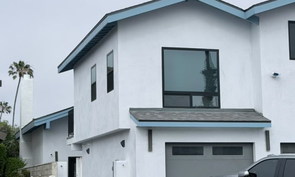
There’s a reason so many homes along the Southern California coast have converged on the same essential palette: white or near-white walls, blue accents at the roofline, and dark window frames. It isn’t trend-chasing. It’s a combination that responds directly to the conditions of coastal living — the quality of light, the proximity to the ocean, the architecture that evolved here over decades — and the result looks right precisely because it is right for this environment.
For homeowners in Ventura, CA and the surrounding coastal communities, understanding why this palette works so well is the first step toward executing it with confidence rather than simply copying it from a neighbor’s house.
The Role of Coastal Light
Light is the invisible variable that makes or breaks an exterior color decision, and coastal California has some of the most distinctive light in the country.
The marine layer that settles over the Ventura coastline most mornings diffuses sunlight into a soft, even glow without harsh shadows. This diffused light is unusually forgiving: colors that look washed out in flat midwestern light or blown out in harsh desert sun read with full depth and clarity here. White stucco in particular absorbs this softness and reflects it back cleanly — not blinding or sterile, but luminous. The effect is a home that appears to glow from within on overcast mornings.
By midday, when the marine layer burns off and direct sun arrives, white stucco keeps the facade from overheating visually. Dark colors in direct coastal sun can look heavy or dense; white remains open and airy even under full sun. And as afternoon light shifts to a warmer, golden tone, white stucco takes on a cream quality that reads as warm and inviting rather than cold.
Blue accents at the fascia, soffits, or trim behave differently at each light phase of the day — cooler and more saturated in the morning marine layer, brightened in midday sun, and deepened to a richer hue in afternoon light. This responsiveness to light is exactly what makes blue such a successful accent color in a coastal environment where the light itself is always moving.
Why Blue Reads as Natural on the California Coast
Color psychology and environmental context are inseparable in exterior design. Colors that echo a home’s natural surroundings read as inherently appropriate — they feel like they belong.
In a coastal environment, blue is everywhere: the ocean, the sky, the distant mountain ranges that turn blue in the atmospheric haze. A home that incorporates blue at the roofline or trim is participating in its landscape rather than competing with it. The eye moves comfortably between the painted surface and the natural environment because the visual language is shared.
This is different from using blue inland, where it can read as arbitrary or assertive. On the coast, it’s nearly inevitable — the question isn’t whether blue belongs, but which blue, and where.
Choosing the Right Blue
Not every blue works equally well as an accent on white stucco in a coastal California setting. The most successful accent blues share a few characteristics:
Muted, slightly grayed blues — sometimes called slate blues or coastal blues — have enough gray in them to avoid reading as primary-color bold. They sit comfortably next to white without creating a hard contrast that looks more patriotic than architectural.
Sky blues and haint blues are lighter values that work particularly well on soffits, fascia, and porch ceilings, where they create a sense of visual lift and openness. Haint blue — a soft blue-green historically used on Southern porch ceilings — has found a natural home in coastal California precisely because its blue-green quality echoes both sky and sea.
Deeper coastal blues — closer to slate or dusty navy — read more dramatically at the roofline and are a stronger choice for homes that want the accent to carry more visual weight. These work best when the rest of the facade is kept clean and simple.
Blues to use with caution: Bright royal blues and pure primary blues can feel jarring against white stucco — they read as decorative choices rather than responses to the environment. Teals and aquas tend to look dated faster than gray-blues. If the blue reads as paint rather than as part of the landscape, it’s working against you.
The Supporting Role of Dark Window Frames and Garage Doors
White stucco and blue accents establish the primary relationship in this palette, but it’s the dark window frames and garage doors that give the composition its structure and visual weight.
On a white facade, windows without dark frames tend to disappear — the glass reads as just another light surface, and the windows lose their architectural presence. Dark charcoal or black window frames solve this by creating strong, defined rectangles that anchor the facade and give it visual depth. The effect is particularly pronounced on contemporary two-story homes, where the window grid is a primary design element.
The garage door follows the same logic. A gray or charcoal garage door — darker than the stucco, lighter than the window frames — adds a third value to the palette and gives the front facade a graduated tonal range from white to mid-tone to dark. This tonal variation is what prevents the facade from reading as flat.
Together, the dark windows and garage door provide the contrast that makes the white and blue pop — without them, the palette can feel too light and undifferentiated.
What Makes This Palette Work for Contemporary Coastal Architecture
The white stucco / blue accent / dark window palette has become closely associated with contemporary coastal architecture in Southern California for reasons that go beyond aesthetics.
Contemporary coastal homes tend to have clean lines, flat or low-pitched rooflines, and large window openings — architectural features that benefit from a restrained color palette. A complex color scheme would compete with the architecture; a simple, high-contrast palette lets the form do the work. White as the primary body color maximizes the impact of clean geometric lines. Blue at the roofline draws the eye upward and emphasizes the profile of the structure against the sky.
The palette is also unusually durable over time. Styles change, but the relationship between white, blue, and the coastal environment doesn’t — a home painted this way in 2010 looks contemporary in 2026 because the palette isn’t a trend, it’s an environmental response.
Applying This Palette: Practical Considerations for Ventura Homeowners
Surface Preparation Matters More on White
White stucco is unforgiving of surface imperfections. Any cracks, patches, or texture inconsistencies that might hide under a darker color are fully visible under white paint. A proper exterior painting project for a white stucco home includes thorough crack repair and surface preparation before any paint is applied — skipping this step produces results that look worse than the original.
Product Selection for Salt Air Exposure
Homes within a mile of the Ventura coastline face accelerated paint breakdown from salt air exposure. High-quality acrylic exterior paints with UV inhibitors and mildew-resistant formulations outperform standard products significantly in these conditions. For white stucco specifically, a paint with dirt-resistance properties helps maintain the clean appearance over time — white shows environmental accumulation faster than other colors.
Testing Blue Accents Before Committing
Blue reads differently at different scales, on different surfaces, and in different lighting conditions. A color chip that looks right indoors can look too cool or too bright on an exterior fascia in marine layer light. Before committing to a specific blue, test a painted sample on the actual surface and observe it at multiple times of day — morning marine layer, midday sun, and late afternoon light each tell you something different about how the color will live on the home.
Ready to Update Your Home’s Exterior Palette?
The white stucco and blue accent combination is one of the most successful exterior palettes in coastal California — but executing it well requires thoughtful color selection, proper surface preparation, and quality products suited to the coastal environment. At RM Empire Painting, we work with homeowners throughout Ventura, CA on exterior painting projects that get the details right from preparation through final coat.
Ready to explore a coastal palette for your home?
Contact RM Empire Painting today for a free estimate.
Our Services
Get A Free Quotes
Got any questions ? Feel free to call us !
Do you have any questions about our services or would you like to request a free estimate? Don’t hesitate to call us at (805) 746-5140. At RM Empire Painting we are always available to provide you with personalized advice and help you transform your spaces with the quality we are known for. Contact us today, we’ll be happy to assist you!

Whether you’re looking to refresh your home or enhance your business, our team of licensed and insured professionals is here to deliver exceptional results.
Our Services
Copyright ©2026 RM Empire Painting, All rights reserved. Powered by Orbis Advisers.