Porch and Covered Patio Color Schemes: How to Connect Outdoor Living Spaces to Your Home's Exterior
Home / Blog
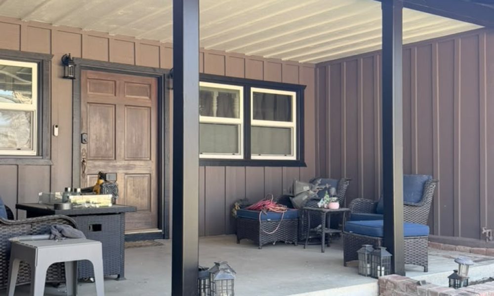
A covered porch or patio is one of the most-used spaces on a California property — and one of the most visually complex to paint well. Unlike an open exterior wall where the color decision is relatively straightforward, a covered porch involves multiple surfaces intersecting in a confined space: ceiling, columns, floor, walls, trim, and often a front door — all visible at once, all needing to work together, and all needing to connect back to the broader exterior palette of the home.
In Ventura’s climate, where outdoor living spaces get year-round use, getting these color decisions right pays off every single day. Here’s how to approach the process.
Why Porches and Patios Deserve Their Own Color Strategy
Many homeowners treat the porch as an afterthought in the exterior painting process — matching whatever color is on the adjacent wall and calling it done. The result is usually a space that feels like a corridor rather than a destination: technically consistent but visually flat.
A covered porch or patio is a transitional space — part exterior, part interior — and it benefits from being treated that way. It has its own light quality (shaded, often warmer in tone than the open exterior), its own surfaces (ceiling, floor, structural elements), and its own relationship to the home’s interior through the front door and adjacent windows. A thoughtful color approach acknowledges all of that rather than defaulting to a simple extension of the exterior wall color.
Start With the Exterior Palette
The porch color scheme doesn’t exist in isolation — it needs to feel like a natural continuation of the home’s overall exterior palette rather than a separate decision made independently.
The connection points to carry through:
- The porch wall surfaces — typically the interior face of the exterior siding or stucco — should match or closely relate to the home’s body color. Changing the color here creates a jarring disconnect when viewed from the street.
- Structural columns and posts should align with the trim color or accent color already established on the exterior. On a home with black trim and dark siding, black columns read as intentional and cohesive; switching to white columns on a dark-trimmed home creates visual confusion.
- The ceiling is where you have the most creative latitude — more on that below.
- The floor color should complement the overall scheme without competing with the walls or ceiling.
The Porch Ceiling: The Most Overlooked Opportunity
The porch ceiling is the surface most homeowners get wrong — either by painting it the same color as the walls (which makes the space feel heavy and closed) or by defaulting to white without considering whether it’s the right choice for the palette.
Options worth considering:
- Haint Blue
One of the most enduring porch ceiling traditions in American architecture, haint blue — a range of soft blue-green tones — has been used on porch ceilings for over a century. Beyond its folklore origins, it works visually because it mimics the sky, making the ceiling feel higher and the porch feel more open. In coastal Ventura, where the sky and ocean already inform the color environment, haint blue reads as particularly at home.
- Soft White or Cream
The most versatile choice and the one that works with almost any exterior palette. A warm cream ceiling on a porch with dark siding and black columns — like the setup in the photo above — keeps the space from feeling too heavy while maintaining cohesion with the overall scheme. Stark white can read as too bright and disconnected on warm-toned homes; a warmer off-white bridges the gap more naturally.
- A Lighter Tint of the Body Color
Using a significantly lighter version of the exterior body color on the porch ceiling creates a subtle tonal connection that feels deliberate without being obvious. On a deep brown or charcoal home, a warm greige or light tan ceiling creates warmth and cohesion while keeping the space from feeling closed in.
- What to Avoid
Painting the porch ceiling the same deep color as the siding walls — unless the porch is very large and well-lit — tends to make the space feel compressed and dark. Similarly, a ceiling color that introduces a completely new hue not referenced anywhere else in the exterior palette will feel disconnected.
Structural Columns and Posts
Columns are load-bearing elements visually, even when they’re primarily decorative — they anchor the eye and define the structure of the porch. Their color should feel grounded and intentional within the overall scheme.
- On homes with dark siding and black trim, matte or satin black columns are the natural choice — they read as structural, authoritative, and cohesive with the trim system.
- On homes with lighter siding and white or cream trim, white or cream columns that match the trim keep the porch from looking top-heavy.
- A column color that matches neither the body nor the trim — a third color introduced only on the porch — almost never reads as intentional and should be avoided unless it’s a deliberate accent choice supported by the rest of the palette.
The Front Door: Where Personality Lives
On a covered porch, the front door is framed and spotlighted in a way that an exposed entry door isn’t. The covered context — shaded, contained, viewed at close range — makes the door color choice more impactful and more visible than it would be in an open entry situation.
Front door color principles for covered porches:
- The door should be the accent in the three-color exterior system — the place where personality and a bolder color choice are appropriate.
- On dark siding with dark trim, a door in a warm natural wood tone creates a welcoming contrast and draws the eye without competing with the structural elements — the natural wood door visible in the photo above is a good example of this approach.
- On neutral or lighter exteriors, the door can carry a bolder hue — deep navy, forest green, terracotta, or even a rich burgundy — that would be too much on the full wall but reads as confident and intentional on a single door surface.
- Matte and satin finishes on doors tend to read better in shaded porch environments than high-gloss, which can look cheap under diffused light.
The Porch Floor
Porch and patio floors are often unpainted concrete or pavers, in which case the color decision is limited to keeping the floor clean and considering whether a sealer or stain makes sense. Where the floor is painted, the approach is straightforward:
- Porch gray — a mid-tone gray specifically formulated for horizontal painted surfaces — is the classic choice and works with almost any wall and ceiling palette.
- A tone that relates to the body color keeps the floor from looking like a disconnected element. On a warm brown home, a tan or warm gray floor feels more intentional than a cool blue-gray.
- Floor paint product selection matters more here than anywhere else — the floor takes foot traffic, furniture, and in Ventura’s climate, year-round exposure to heat, moisture cycling, and UV radiation. A product specifically rated for porch and floor use with appropriate abrasion resistance is non-negotiable.
Pulling It All Together: A Sample Scheme
For a Craftsman ranch home with dark brown board and batten siding, black structural elements, white window frames, and a natural wood front door — the surfaces visible in this property — a cohesive covered porch palette looks like this:
- Porch walls (interior siding face): Match the exterior body color — dark brown board and batten
- Ceiling: Warm cream or soft off-white — keeps the space light without disconnecting from the warm palette
- Columns and structural posts: Matte black — consistent with trim and structural elements throughout the exterior
- Window trim surrounds: White — consistent with the window frames on the rest of the home
- Front door: Natural wood stain or a deep warm tone (walnut, mahogany, or a rich brown) — provides warmth and welcome against the dark siding
- Floor: Warm gray or tan porch floor paint — grounds the space without competing with the walls or ceiling
Every color in this scheme is already referenced somewhere else on the exterior — nothing is introduced that doesn’t belong.
Get the Right Colors for Your Outdoor Living Space
A covered porch or patio that feels cohesive with the home’s exterior doesn’t happen by accident — it’s the result of treating each surface as part of a connected system rather than a series of independent decisions. At RM Empire Painting, we help homeowners throughout Ventura, CA choose porch and patio palettes that feel intentional, connected, and built to hold up in our year-round outdoor living climate.
Ready to transform your porch or patio?
Contact RM Empire Painting today for a free estimate.
Our Services
Get A Free Quotes
Got any questions ? Feel free to call us !
Do you have any questions about our services or would you like to request a free estimate? Don’t hesitate to call us at (805) 746-5140. At RM Empire Painting we are always available to provide you with personalized advice and help you transform your spaces with the quality we are known for. Contact us today, we’ll be happy to assist you!

Whether you’re looking to refresh your home or enhance your business, our team of licensed and insured professionals is here to deliver exceptional results.
Our Services
Copyright ©2026 RM Empire Painting, All rights reserved. Powered by Orbis Advisers.